01 · Task
Task
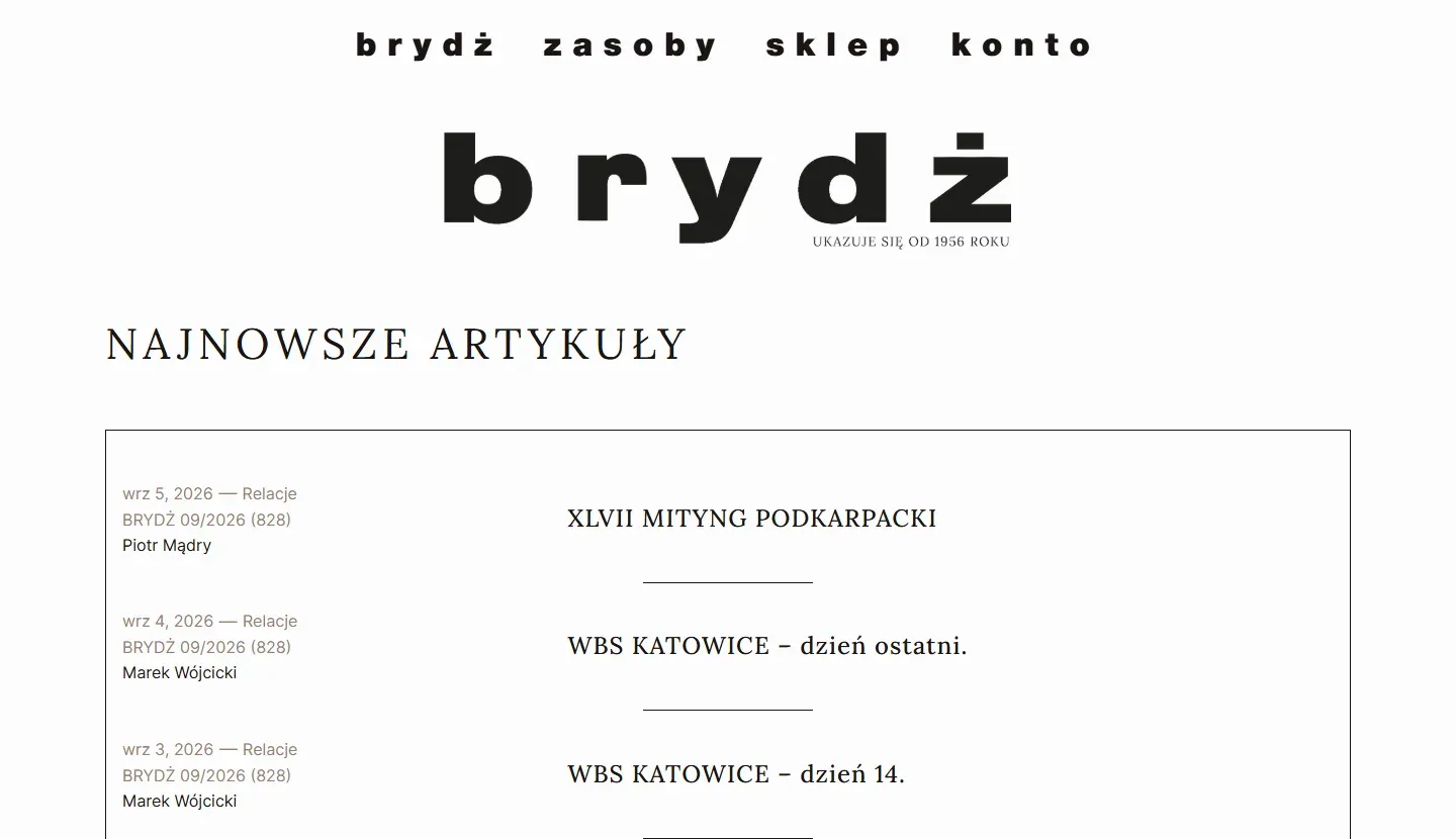
Miesięcznik „Brydż” is a monthly magazine published since 1956, and for several years it has also had an online edition. The website’s archive holds more than a thousand articles from the print edition, alongside bidding systems and digitised books. Together with a graphic designer, the editors prepared detailed visuals of the new header section for articles: the category on a bar, the title and author centred, the issue number and date aligned to fixed axes, and a header image in set proportions. The editors expected the design to be reproduced one to one, on phones as well. They also wanted to switch archive texts to the new look at their own pace, without changing the content below the image and without replacing the theme.
02 · Solution
Solution
I added the new post template in a child theme, so updates to the parent theme do not overwrite anything. The template is applied only when an editor selects it in the post settings. After that, the editor adds the header image and checks the issue number, date, author and category, and the template generates the rest of the header from the article’s data. The previous layout remains the default, and the selection mechanism is ready for further template variants.
I reproduced the header section from the editors’ visuals, matching the proportions, spacing and typefaces. In the process, I fixed the font loading in the theme: resources loaded over HTTP made browsers fall back to a substitute typeface, including in the top menu. The mobile version scales the whole layout rather than simplifying it: the category bar keeps its proportions, and the issue number and date stay on one line even at 320 px. I worked in stages on a staging copy, where the editors’ three rounds of comments dealt only with details, and after their approval I deployed everything to the main domain.
03 · Result
Result
Articles from the print edition now have their own consistent look on the website, and preparing such a text comes down to selecting the template and uploading an image. The editors switch archive texts at their own pace. They hold full rights to the template code and can develop it as they wish, including with another developer. The article content below the image and the previous template were left untouched, and the theme can still be updated.